Chelsea Football Club plays in the Premier League and are based in London, hosting matches at Stamford Bridge. Their kits are supplied by Nike who have supplied ‘The Blues’ shirts starting in the 2017/18 season. They had been previously sponsored by Samsung and Yokohama Tyres before Three UK took over in 2020. As implied by their nickname, Chelsea traditionally plays with a blue home kit.
- Latest Release – New Chelsea Kit
- Chelsea Away Kit
- Chelsea Third Kit
- Previous Chelsea Home Kits
- Children’s Chelsea Kit
- Chelsea Goalkeeper Shirts
- Men’s Chelsea Shirt
Chelsea 23/24 Home Kit
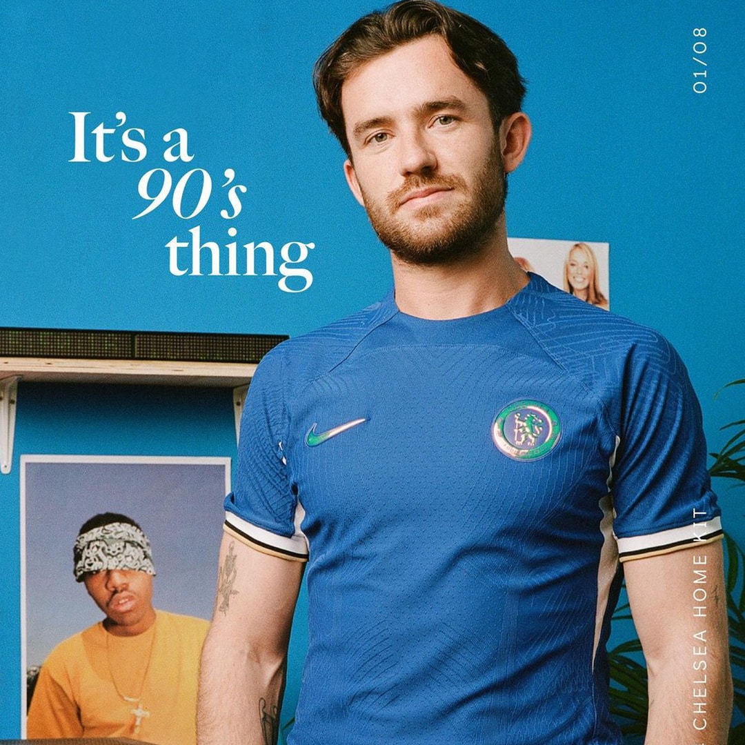

In 2023/24, Chelsea featured its Nike blue home shirt with an accent that evoked memories of the 1997/98 home kit. The said season was a relative success in terms of knockout competitions: the club won not just the league cup but also the UEFA Cup Winner’s Cup, and also secured the UEFA Super Cup the following season. With this in mind, the 2023/24 Chelsea home incorporated white underarm side trims and sleeve cuffs (which had a split edge striping in navy and yellow), both clear influences from the source kit. The modern Chelsea outfit also had the Swoosh and the crest in a golden finish to reflect the silverware they had won from the earlier campaign.


2022/23 Chelsea Home Shirt
 Chelsea lived up to its ‘The Blues’ nickname with another blue home for the 2022/23 campaign. The Nike shirt had limited secondary colour applications, and much of it was sourced from the collar in white with a turquoise lion pattern. The white Swoosh also glowed with a turquoise outline. Nike’s introduction of a new Vapor Match knit pattern was symbolic of the club’s innovation under Drake.
2021/22 Chelsea Home Shirt
 Chelsea players wore a Nike-produced blue home shirt for the 2021/22 football season. While the shirt went with a traditional blue base colour, it had a modernistic all-over graphic of zigzags and checkers in a warped effect. As such, the jersey’s print looked to be a combination of Nigeria’s popular Naija and Croatia’s iconic checkers. Completing the design elements of the shirt were Nike’s zap side panels in yellow and the dark blue curving v-collar that crisscrossed on the front and back.
2020/21 Chelsea Home Shirt
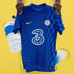
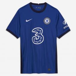 The best of Stamford Bridge geared in the 2020/21 season with their traditional blue colour for their home kit. This addition to the home kit history of Chelsea marked the first of hopefully many more kits carrying the branding of the club’s new main . The usual blue base of Chelsea’s new home kit serves as a backdrop for the white Swoosh and full-coloured club crest on the chest area, plus the corporate livery of their sponsor, network operator Three. Together with the dark blue collar, sleeve cuffs and side trims, the understated blue look was inspired by London as a men’s fashion hub.
Children’s Chelsea Kit
Since producing replica kits the club have manufactured youth shirts to suit the young fans of the club. The most popular shirts worn by kids in the past twenty seasons include Didier Drogba, Frank Lampard, John Terry, Dennis Wise and Gianfranco Zola.
The Chelsea Reserves and Academy have a strong history of producing and developing players such as John Terry, Terry Venables, Ray Wilkins and Jimmy Greaves. The side have won the FA Youth Cup on several occasions with their last title in 2012.
Chelsea Goalkeeper Shirts
Chelsea’s goalkeeper kits have predominantly been green, orange and white with odd yellow and black as well. Their current goalkeeper Petr Cech has become one of the clubs best ever goalkeepers who won Chelsea Player of the Year in 2011.
Peter Bonetti made over 700 appearances for the club during the 60’s and 70’s. William Foulke was the first ever goalkeeper at the club in 1905.
Men’s Chelsea Shirt

The club’s home shirt had barely changed throughout the years but differences began to occur in the early 1980s as white and red details started to appear on various designs. Gulf Air were the first company to have their logo placed on the Chelsea home shirt in 1983. However, it was only there a season before the team reverted back to a logo free design. Nevertheless, Commodore were present on the clubs 1987 shirt and have since been followed by numerous sponsors such as Coors, Autoglass and Samsung.
Famous home kits include the 1905 blue kit which was their first in their history and the 1955 home shirt which marked their first league triumph. Other notable shirts include the 2012 blue home kit which marked their first European title. Didier Drogba scored the equalising goal and the winning penalty in the final against Bayern Munich.

Since Roman Abramovich purchased the club in 2003 the shirts have probably had some of the most expensive and best known names in the sport to wear them, boasting powerhouse names including John Terry, Eden Hazard, Ashley Cole, and Frank Lampard
Chelsea were formed in 1905 after the owner of the Stamford Bridge got declined by Fulham in leasing the stadium to the said club. Names like London FC and Stamford Bridge FC were considered, but eventually settled with Chelsea, the name of the adjacent borough.
Even before the recent well known names Chelsea shirts have been worn by famous names such as Peter Osgood, Jimmy Greaves, Peter ‘The Cat’ Bonetti, Gianfranco Zola, Rudd Gullit and Gianluca Vialli.