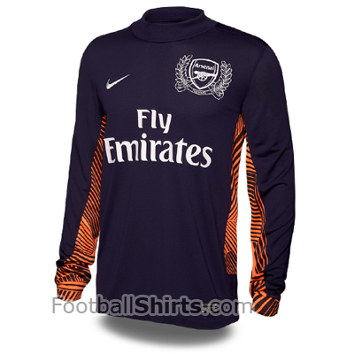
Arsenal Home Goalkeeper Shirt 2011/12
Popular English club Arsenal from Northern London, is one of the best clubs in the country, having won the top league in England a total of 13 times and the FA Cup 10 times, amongst others. This year, the club is celebrating its 125th year anniversary since it was set up as Dial Square. In the 2009/10 season, they ranked 3rd and in the 2010/11 season, they look set for the same league position, where until the 35th matchday, they are 3rd with 3 points behind Chelsea in 2nd.

We have brought you the unveiling of the new home shirt of Arsenal earlier this week. Now we bring you a picture of the Gunners’ new goalkeeper strip for the 2011/12 season. Arsene Wenger has trusted young Polish goalkeeper Wojciech SzczÄ™sny between the sticks towards the latter part of the season, and it remains to be seen if he has done enough to convince the French manager that he can be Number One next season. In total, until the 35th matchday, Arsenal have conceded 36 goals, more than the other three clubs in the Top Four. The goalkeeper of Arsenal next season will wear a dark blue shirt, with orange stripe details on the sides, on the underarms and on the sleeves. The commemorative crest of Arsenal will appear on the shirt, and the logos of Nike and Fly Emirates will appear in white.

Originally from Malta and I love football. I appreciate the opportunity that this website gave me to start my career in football journalism. I’m a Man Utd fan and England supporter, and I watch football games mainly from England, Germany and Spain. I love to be informed about everything that is happening in the world of football.


So is this the new template for the goalie this season…? Hmmmm… better than the zigzaggy sleaves.
The neck is a bit high… otherwise not bad. That badge is huge.
The pattern is a disaster. No class in this.
Disagree. Quite like this. A lot better than the zebra stripes
Much better than the boring zigzag stripes on current GK template.
Badge a tad to big for this year kits.
Nice clean template…classy n retro yet up-to-date
nice 🙂
@Naughtius Maximus; the badge looks big on the new united kits as well…
I think the badge only looks big on this because of the design around it aswell. Although as far as i’m aware some teams are going for the ‘retro’ look and making their badges/crests bigger. Rangers have done it for their new kit and it looks well.
if you look at all the arsenal crests in the team’s history, this is by far the one with less class, less elegance, less style. Arsenal always had beautiful crests, and I mean from the very beginning..
like the big jens lehmann style collar.
I don’t know what it is but when i look at the pic i suddenly feel like a bowl of Frosties.lol!
oh dear WTF is wrong with this.That’s awful
Its growing on me hopefully we will be able to slot a few past this next season
i’m a Morecambe supporter and i think that is gorgeous. Much antisipating the new Morecambe kit 🙂 hoping for a nice strip
Someone on the news staff is a bit colourblind, methinks! This kit is purple, not blue!
this is pretty cool
and no they are not color blind it is a dark violet blue violet has more blue than red therefore it is blue
Have you guys seen the arsenal polo shirt taht would have made a sick arsenal home kit
@ land (number 15)
The official description on both the Arsenal website and the new Arsenal catalogue is PURPLE. P-U-R-P-L-E. Have you seen the new kit in the flesh, or just the picture above? Because if you have you’d know that the kit is even deeper purple than Deep Purple themselves. What part of ‘purple’ are you just not getting here?
looks like older kits somehow, i lkie it!
Well done Nike,better than 2010 kit
Gonna look epic On a new keeper! 😀
OKKKKKK.Nike do betterrrrrrrrrrrrrrrrrrrrrrr!